
Key Insights from User Research
To understand why students weren't converting, I spoke with pre-med students who were actively preparing for the MCAT or had recently gone through the process. The assumption going in was that price was the primary barrier. What students actually described was something harder to solve: they didn't know where to start, and a platform that didn't immediately show them a clear path forward felt like one more thing working against them.
Overwhelming and unstructured content
Students weren't struggling because the material was too hard. They were struggling because nothing told them what to tackle first. Without a visible structure, even motivated students felt paralyzed before they had completed a single lesson. That feeling of being lost was showing up before students had given the product a real chance.
High cost of reputable resources & quality of free resources
Students were already skeptical about whether a lower-cost option could actually prepare them well enough. That doubt meant the platform had to work harder to establish credibility at every touchpoint. Unclear structure and inconsistent presentation were quietly confirming the fear that the product was too good to be true.
Clarity on progress
Progress feedback was either absent or too abstract to be meaningful. Students wanted to know not just what they had done, but whether it was working. Without that signal, staying motivated over a 26-week study plan became very difficult to sustain.
Translating Insights into Design Direction
Affinity Mapping
With interviews complete, I used affinity mapping to move from individual student stories to shared behavioral patterns. Grouping observations by theme rather than by participant revealed that the problems weren't random. Five consistent themes emerged, and the two that cut across every single participant were structure and trust. Students weren't failing to engage because they lacked motivation. They were failing to engage because the experience never gave them a confident starting point.
Cost and Accessibility
Resource effectiveness
Burnout and Stress
Structure and Guidance
Burnout and Stress
User Personas
The research pointed to two students who struggled in different ways. Avery is anxious and needs the platform to immediately signal that she is in the right place and on the right track. Jordan is efficient and goal-oriented, but disengages quickly when navigation requires more effort than the studying itself. Building both made one design requirement non-negotiable: clarity had to come before depth. If either student couldn't orient themselves within the first few moments, neither would stay long enough to find the value.
Persona Archetype 1: Avery (Anxious Exam Prepper)
Persona Archetype 2 : Jordan (Efficiency-Driven Learner)
Improved Site Map
Before designing any screens, I needed to understand why students were getting lost in the first place. The existing structure buried key information and forced students to make decisions before they had enough context to make them confidently. Rebuilding the site map meant reorganizing the entire experience around how students actually think about MCAT prep, starting with understanding their options, then committing, then executing. That sequence became the backbone of every navigation decision that followed.
Site Map
Key Flows Mapped
Mapping the key flows revealed exactly where student confidence broke down. The path from discovering a program to actually signing up passed through too many ambiguous decision points with too little supporting information at each one. Seeing the full journey laid out made it impossible to ignore how many moments were asking students to trust the product before the product had given them a reason to. Every friction point that surfaced in the flows became a specific design problem to solve.
User and Task Flows
Exploring Structure
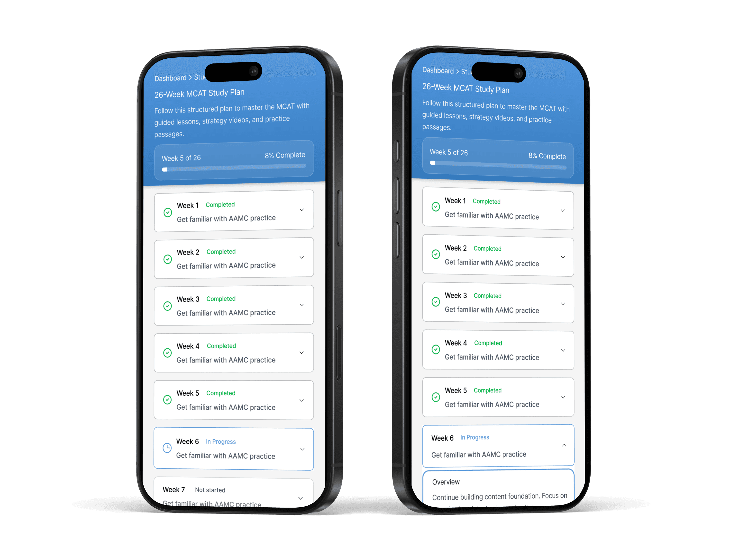
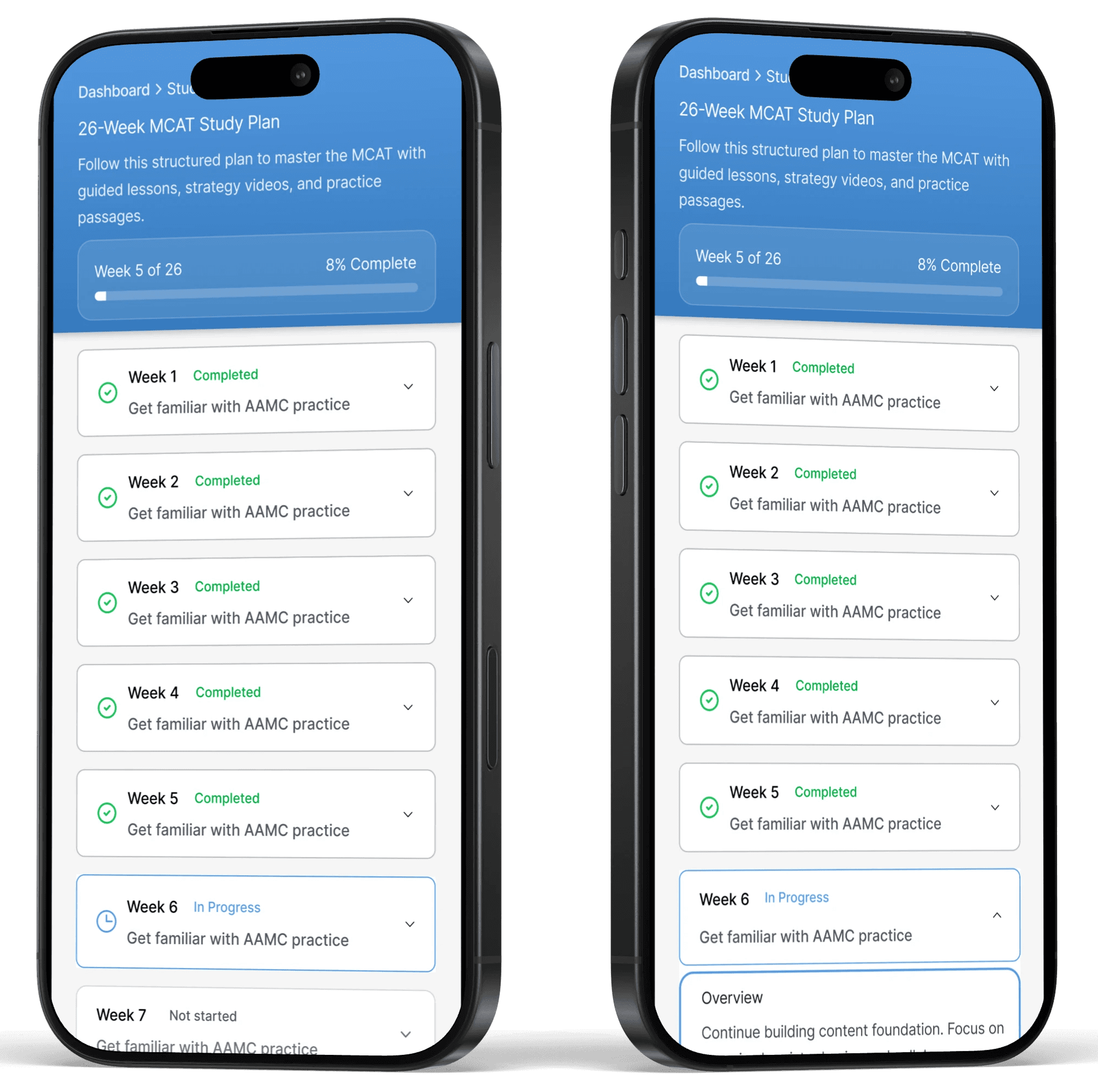
Low and mid fidelity wireframes tested one question at a time: what does a student need to see first, and what can wait? Early versions of the dashboard made clear that students needed a progress signal within the first screen they landed on after signing up. Without it, the experience felt like it started and then immediately stalled.

3 solutions that address the three core challenges
Less guessing, more clarity: a guided study dashboard
Students weren't failing to study hard enough. They were failing to know what hard work should look like on any given week. The dashboard was designed to answer that question before a student had to ask it, surfacing a weekly study plan that breaks 26 weeks of prep into steps small enough to feel completable and structured enough to build real momentum over time.
Competitive analysis insight
Major competitors provide strong content but leave students to assemble their own plan from disconnected videos, question banks, and timelines. The structure students desperately needed was the one thing the market wasn't providing.
Added feature after user testing
Students were losing their place when moving between sections of the platform. Adding breadcrumb navigation gave them a persistent sense of where they were and how to get back, reducing the disorientation that was quietly eroding confidence.
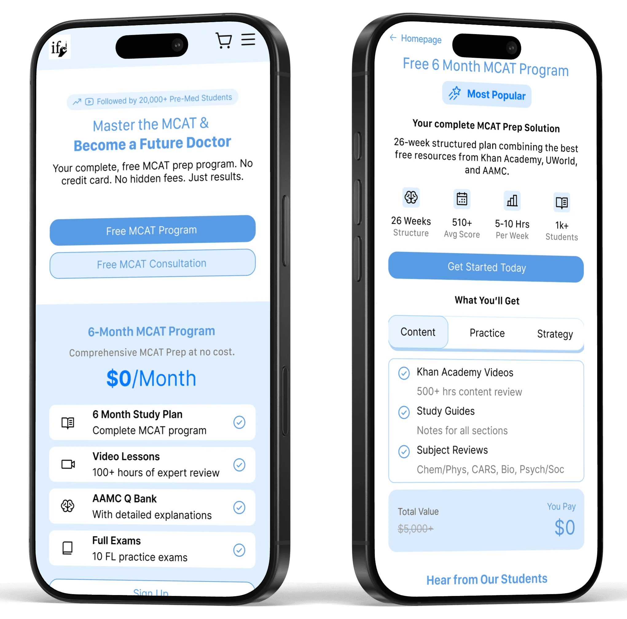
Making value visible: transparent offerings and real results
Affordable tools carry a credibility problem before a student has seen a single lesson. The assumption that low cost means low quality was already in the room. Rather than asking students to trust the product on faith, the redesign made the value concrete: clear visual breakdowns of what each program includes, direct comparisons to premium competitors, and real student outcomes front and center. Trust had to be earned on the page, not assumed after sign-up.
Added feature after user testing
Students who explored program details had no clear way back to the homepage without using the browser. Adding a persistent return path kept students inside the experience instead of losing them the moment they wanted to reconsider their options.
Easy "return to home" functionality
Students who explored program details had no clear way back to the homepage without using the browser. Adding a persistent return path kept students inside the experience instead of losing them the moment they wanted to reconsider their options.

Progress you can see, improvement you can trust
Motivation over a 26-week study plan doesn't come from willpower. It comes from visible evidence that the effort is working. The dashboard was built around three signals students said they needed most: a streak tracker that rewards consistency, progress indicators that show momentum across the full timeline, and a score tracker that makes improvement impossible to miss. Together they turn abstract effort into something students can actually see building over time.
Competitive analysis insight
Competing platforms invest heavily in content delivery but almost nothing in progress feedback. Students finish lessons with no signal that they are moving in the right direction, which is exactly where burnout takes hold. The dashboard was designed to close that gap.

Explore the Prototype
See the full experience in action before diving into usability testing results.
Validating what works and revealing what to improve
Testing focused on the two actions that mattered most to IFD's business: whether students could sign up for a program and whether they could complete a purchase, both without any assistance.
Sign up for free MCAT program
Purchase product
Performance metrics
100% task completion - Every participant successfully signed up for the free program, opened the lesson plan, and completed a guide purchase without guidance, confirming that the core conversion flows were clear enough to stand on their own.
8.8 out of 10 satisfaction - Students consistently described the platform as clean and easy to navigate, a meaningful shift from the confusion that research had surfaced at the start of the project.
Key Insights That Shaped the Next Iteration
Pricing clarity needed to come earlier - Users were making it deep into the experience before understanding what was free and what required payment. Surfacing program pricing and free tier labels earlier in the flow would remove a point of hesitation that was appearing too late to fix gracefully.
Visual hierarchy needed more contrast between sections - Some pages felt flat because content areas blended together without enough spacing or visual separation. Students were reading more than they needed to just to orient themselves on a page.
Final thoughts
This project was a good reminder that business problems and user problems are not always the same thing. IFD's sign-up numbers were low, but the fix wasn't a better call to action or a smarter pricing strategy. It was trust. Students needed to feel confident before they could commit.