Key Insights from User Research
To understand how people actually engage with their wearable data, I conducted user interviews with daily wearable users. The assumption going in was that users wanted more data or better visualizations. What they described instead was a trust problem. The scores didn't always match how they felt, and with no way to record that disconnect, users had no way to make sense of it over time.
Score-checking drives behavior, not understanding
71% of participants checked their scores daily, but most described it as a reflex rather than a ritual. They were opening the app out of habit, not because they knew what to do with what they found. That pattern made clear the product wasn't building understanding, it was just sustaining a checking loop.
Perception and data frequently feel misaligned
Users regularly opened the app expecting one result and got another. When that happened, there was nowhere to put that feeling. No way to flag it, track it, or return to it. Over time that silent disconnect quietly eroded how much users trusted their own data.
No structured way to track how they feel over time
Biometric data accumulated automatically in the background while subjective experience was never captured at all. Users had months of scores but no personal record alongside them, making it nearly impossible to spot the patterns that would actually change behavior.
Translating Insights into Design Direction
Affinity Mapping
With user interviews complete, I needed to move from individual stories to shared patterns. Affinity mapping groups observations by theme rather than by participant, which surfaces behavioral trends that individual responses can obscure. What emerged across the data were five consistent themes, and the one that cut across all of them was the same: users were engaging with their data passively, checking without ever reflecting. That became the design problem to solve.
Lack of subjective tracking
Desire for trend-based insights
Routine-based usage
Passive engagement
Perception vs. data misalignment
User Personas
The themes pointed to two distinct users who needed the same thing in completely different ways. Alex tracks scores with intention and wants structured reflection that helps him understand trends over time. Taylor checks her ring out of habit every morning and will abandon anything that slows that routine down. Both needed the self-check feature, but the same interaction couldn't serve both.
That tension set the constraint that every design decision had to answer: could one feature be lightweight enough for Taylor and meaningful enough for Alex at the same time?
Persona Archetype 1: Alex (Score-Driven Optimizer)
Persona Archetype 2: Taylor (Routine-Based Checker)
Key Flows Mapped
Before designing anything new, I mapped the existing morning interaction exactly as it happened today: open the app, scan the score, close it. That three-step habit was the entry point and the obstacle at the same time. Mapping it made clear that the self-check couldn't live outside that flow or after it. It had to fit inside the moment users were already in, or it would never be used.
User and Task Flows
Exploring Structure
Early concepts tested one core question: at what point in the morning flow does capturing how you feel actually make sense? Too early and users don't have context. Too late and they've already seen their score, which biases their answer. Low fidelity explorations helped identify that the right moment was before the score was revealed, turning the check-in into something that felt like a natural first step rather than an added task. That timing decision shaped interaction details that followed.

3 solutions that address the three core challenges
Each solution targets one stage of the same broken loop: users check, feel nothing, and move on. Together they turn that passive habit into something that builds meaning over time.
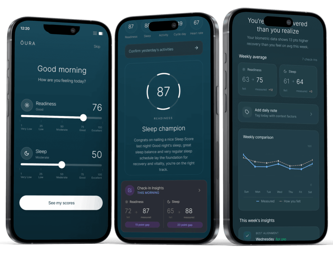
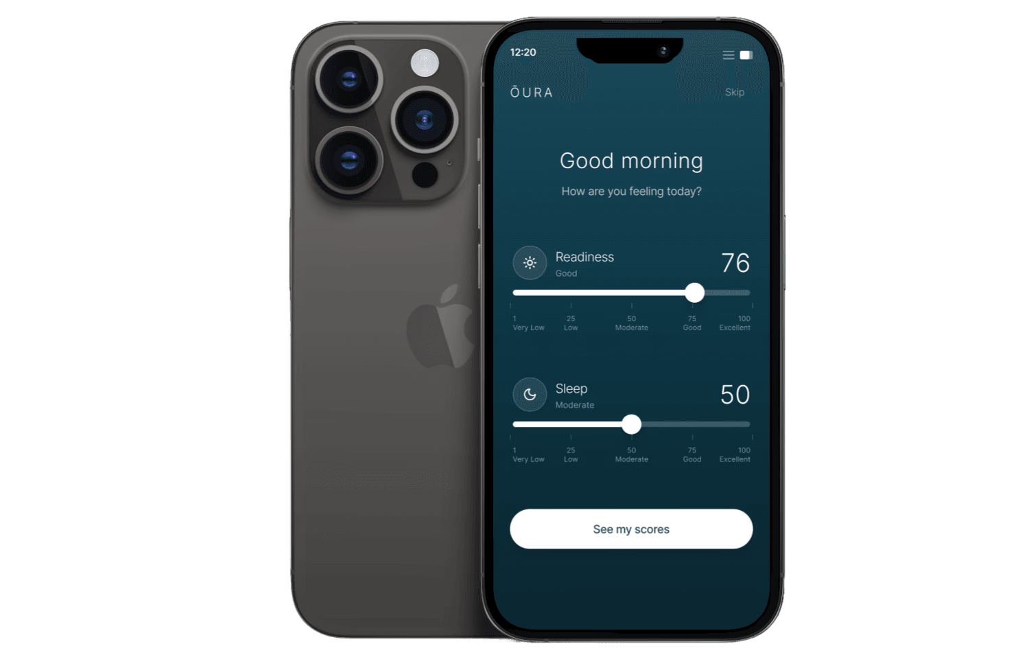
Giving users a voice before the data: the morning check-in
The research showed users already had an expectation before they opened the app. They just had nowhere to put it. Placing a lightweight check-in at app open, before scores are revealed, captures that unbiased impression while it still exists. The timing was deliberate: once a user sees their score, their perception shifts to match it. Capturing how they feel first preserves the honest input that makes the comparison meaningful.
Competitive analysis insight
Most wearable apps open directly to scores, which immediately anchors how users interpret everything else. No existing tool captures subjective state before that anchor is set.
Added feature after user testing
Users hesitated when input labels felt vague or clinical. Refining the microcopy to feel conversational and keeping the skip option clearly visible reduced that hesitation, keeping the interaction under the time threshold where it would start to feel like a chore.

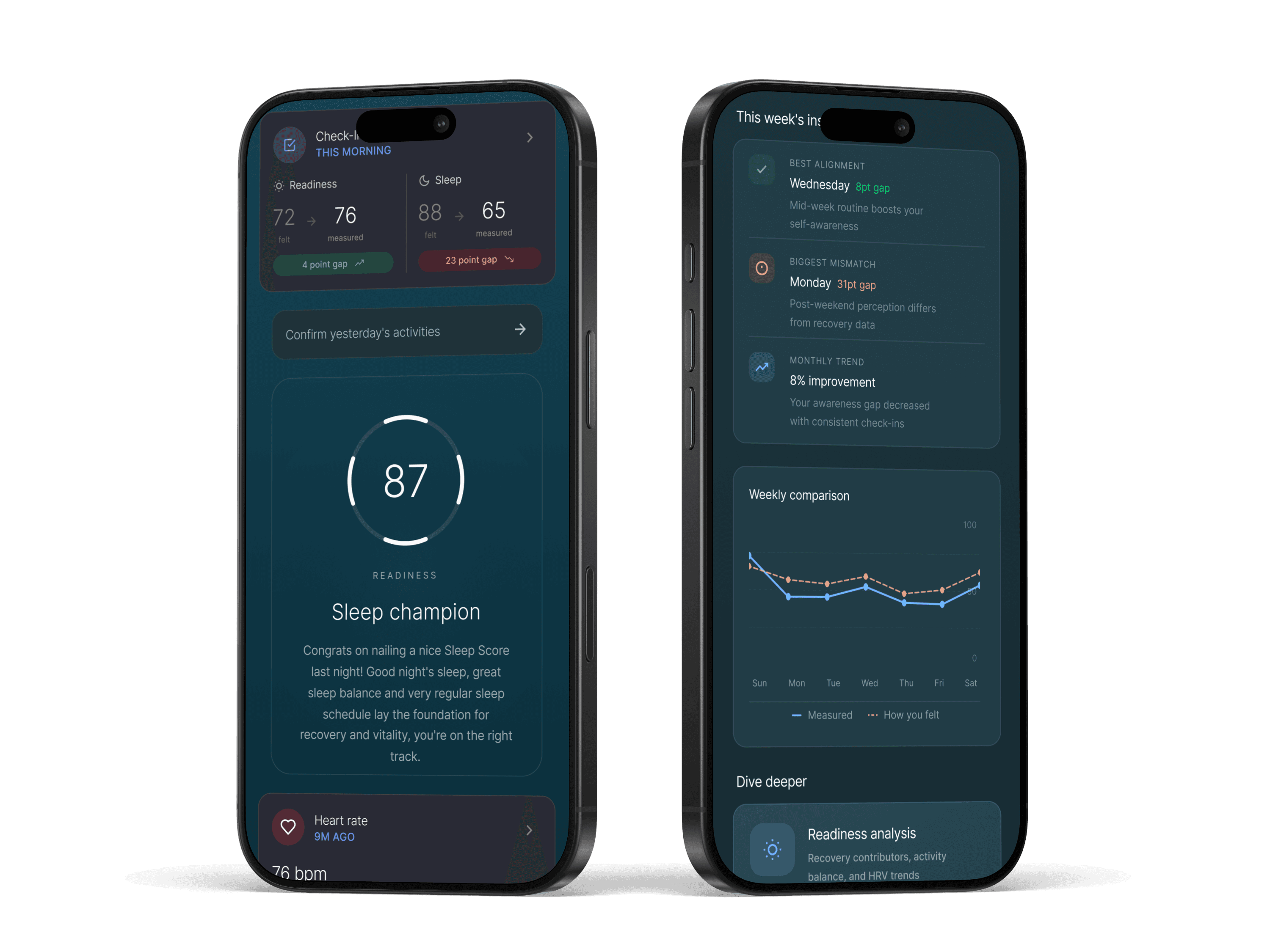
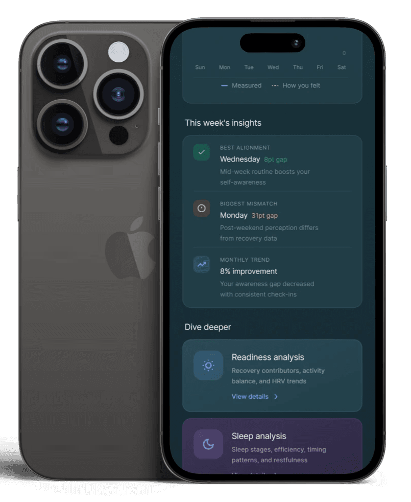
Making the gap meaningful: felt vs. measured alignment
Capturing how users feel only matters if they can see it next to what the data says. The score reveal was redesigned to surface both in the same moment, so the comparison requires no extra steps. Rather than sending users to a separate view to find their check-in, the alignment is immediate and part of the same screen they already open every morning.
Competitive analysis insight
Competing platforms respond to user confusion by adding more data, which deepens the problem rather than solving it. More numbers without personal context doesn't build understanding, it builds overwhelm.
Added feature after user testing
Users could see both inputs but weren't always sure how to interpret the relationship between them. Directional cues and contextual labels were added to make it immediately clear whether their perception was above or below their score, helping users understand the data without doing the interpretive work themselves.
Turning daily inputs into patterns users can trust

Validating what works and revealing what to improve
Testing focused on two things: whether users could complete the check-in quickly enough that it wouldn't disrupt their morning routine, and whether they could make sense of the alignment between how they felt and what their data showed. Both had to work without explanation. If either required guidance, the feature had already failed its core purpose.
Complete daily self check
Interpret alignment between felt and measured data
Performance metrics
100% task completion — Every participant completed the daily check-in without assistance, confirming the interaction was intuitive enough to stand alone.
80% immediate comprehension — Most users understood the relationship between their input and their score without any additional context, validating the score reveal design.
38s avg. completion time — Users finished well under the 60 second goal, confirming the check-in fits inside a morning habit without becoming one more thing to get through.
Key Insights That Shaped the Next Iteration
Check-in inputs needed clearer framing - Some users hesitated not because the interaction was hard, but because they weren't sure what they were being asked to measure. The fix wasn't simplifying the inputs. It was giving them enough context to answer with confidence.
The input-to-insight connection needed to be made visible. - Users found the concept valuable but didn't always see how their check-in shaped the insights shown. Making that relationship explicit, not just implied by proximity, became the next design priority.
Alignment insights needed clearer prioritization - Users consistently identified alignment as the most valuable part of the experience, but its placement and visibility did not always reflect its importance.
Final Thoughts
This project reinforced something I'll carry into every health and wellness project: data without personal context is just noise. The most meaningful design decision wasn't a UI pattern or an interaction detail. It was the timing, capturing how users feel before the score has a chance to influence the answer. That one constraint shaped everything else, and getting there required research, not assumptions.